
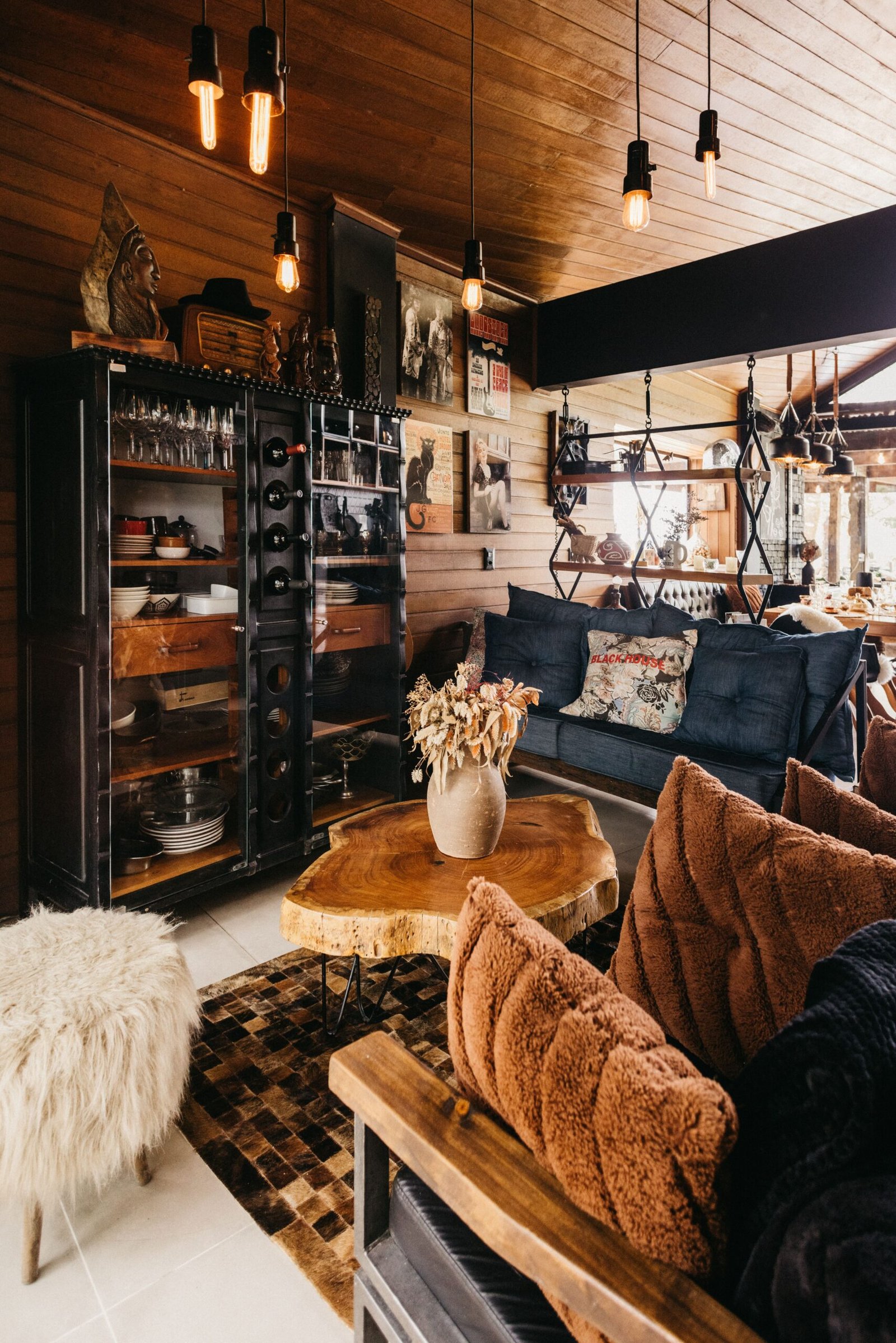
Most real rooms do not start with a matching furniture set. They start with a table inherited from a parent, a bookcase bought years ago, a floor laid by a previous owner, and a chair picked up because it was comfortable and affordable at the time. Put those pieces together and the question quickly becomes: do all these different woods actually go together, or will the room always look like a collection of leftovers?
The good news is that mixing wood tones is not only possible, it is often what makes a room feel collected, warm and lived-in rather than flat and showroom-like. Rooms with a single, perfectly matched wood finish can look tidy, but they can also look a little one-note, as if everything arrived in the same delivery. Rooms that mix woods thoughtfully gain depth and character, because the eye has different grains, colours and textures to enjoy. The trick is not to match everything, but to make the differences look intentional.
Warm, Cool and Neutral Wood Undertones
Every wood has an undertone: a hint of colour underneath its main brown, grey or pale tone. Warm woods lean towards red, orange or gold. Think of honey-coloured oak, rich cherry, warm walnut with reddish notes, and pine that has deepened to a golden colour over time. Cool woods lean towards grey, ash or a slightly blue or green-grey cast. Think of grey-washed oak, weathered timber, and pale woods with a silvery or ashy finish. Neutral woods sit in between, with a more straightforward brown or pale tone that does not pull strongly in either direction.
Undertones matter more than the exact shade of a wood, because two woods can look similar at a glance but clash once they sit side by side. A warm, reddish table next to a cool, grey-toned floor can feel jarring, not because either piece is unattractive, but because their undertones pull in opposite directions. Conversely, two woods of quite different depths — a pale oak and a deep walnut, for example — can sit happily together if they share a warm undertone, because the eye reads them as variations on the same family rather than as opposites.
Quick ways to read a wood tone
- Warm: golden, honey, amber, reddish or orange hints, especially in oak, cherry and some pines.
- Cool: grey, ash, silver or weathered hints, especially in grey-washed or limed finishes.
- Neutral: mid-brown, pale beige or soft taupe without a strong warm or cool pull.
- Deep versus light matters less than undertone: a pale warm wood and a deep warm wood usually pair more easily than two mid-toned woods with opposite undertones.
If you want to explore how different timbers look and behave, the Wood Database is a useful reference for photographs and descriptions of many common woods. It will not tell you what suits your room, but it can help you put a name and a visual reference to a tone you are trying to describe or match.
Pick One Dominant Wood
When several wood tones share a room, one of them needs to lead. The dominant wood is the tone that appears most, usually in the largest pieces or across the largest surface. In many rooms, the floor is the dominant wood, simply because it covers so much area. In other rooms, it might be a large dining table, a substantial bookcase, or a set of kitchen cabinets. Whatever it is, the dominant wood sets the undertone direction for the room, and the other woods play supporting roles.
Repeat Each Tone at Least Twice
Repetition is the simplest tool for making mixed woods look deliberate. A wood tone that appears only once in a room can look accidental, as if it wandered in from somewhere else. The same tone appearing twice — or more — looks like a choice. That second appearance does not need to be large or identical. A walnut dining table repeated in a walnut picture frame, a walnut tray, or walnut handles on a cabinet is enough to signal that the tone belongs in the room.
Practical repetition ideas
- Frames: use the same wood tone for two or three picture frames, even if the pictures themselves are different.
- Trays and boards: a serving tray, a chopping board or a decorative bowl in a supporting tone can echo a larger piece without a big purchase.
- Small furniture: a stool, a plant stand or a side table in a supporting tone can bridge the gap between two larger pieces.
- Shelves: open shelving in the dominant or a supporting tone can repeat that tone across a wall and tie separate areas together.
When to Add Paint or Fabric to Bridge Tones
Sometimes, even with a dominant wood and good repetition, two tones still feel like they are competing. That is where paint and fabric come in, not as a way to hide wood, but as a bridge between tones. A painted piece, a fabric seat, a rug, or a curtain can sit between two woods and soften the transition, giving the eye somewhere neutral to rest.
Paint is particularly useful for pieces that are not in good condition, that you do not love in their current finish, or that clash strongly with the dominant tone. Painting a single side table, a chair frame, or a set of shelves in a colour drawn from the room — a soft white, a warm neutral, a muted green or a deep, calm shade — can turn a clashing piece into a deliberate accent. The painted piece no longer competes as a wood tone at all, which instantly reduces the number of tones in the room. It also adds a layer of colour and texture that can make the remaining woods feel more harmonious.
Fabric works in a similar way, but more softly. A chair with a fabric seat, a sofa with wooden legs in one tone and cushions in a warm neutral, or a bed with a wooden frame softened by bedding and throws, all use fabric to break up large areas of wood. Rugs are especially powerful bridges, because they sit between the floor and the furniture. A rug with warm, neutral tones can connect a warm floor to cooler furniture, or vice versa, by giving both tones a shared ground to sit on. Curtains and throws can do the same on a smaller scale, by introducing a colour or texture that relates to both tones.
When choosing a bridging colour, look at the room as a whole rather than at one piece. A warm minimalist palette, with soft neutrals, natural fibres and gentle warmth, often works well as a bridge because it does not introduce a new strong colour that competes with the woods. For inspiration on that kind of calm, neutral layering, see Warm Minimalist Decor Ideas for Calm, Cosy Rooms. A whole-home colour approach can also help, because a consistent palette across rooms makes individual wood differences feel less abrupt; How to Choose a Whole-Home Colour Palette explains how to build that consistency without making every room identical.
The Japandi approach offers another useful lesson here, because it deliberately mixes woods, often pale and mid-toned, and uses natural fabrics, soft neutrals and uncluttered styling to keep the mixture calm. Reading Japandi Interior Design: Calm, Natural and Practical can help you see how restraint, texture and a limited palette allow different woods to coexist without feeling busy. The lesson is not to copy a style, but to notice how much bridging work is done by everything around the wood, not by the wood alone.
FAQ: Mixing Wood Tones
Can warm and cool wood tones ever work together?
Yes, but they need help. A single warm piece in a cool room, or vice versa, will usually stand out. If you want to mix warm and cool tones, repeat each tone at least twice, choose one as the dominant tone, and use paint, fabric or a rug to bridge the gap. A neutral tone in between can also soften the contrast, so the room feels varied rather than divided.
How many different wood tones can one room handle?
Two or three distinct tones usually work well, especially when each tone is repeated. More than that can still work in a large, carefully styled room, but it becomes harder to keep the result calm. If a room feels restless, counting the tones is a useful diagnostic: removing or painting one tone often brings the whole room into focus.
Should my furniture match my wood floor?
It does not need to match exactly, and an exact match can sometimes look flat. What matters more is undertone. Furniture that shares the floor’s warm, cool or neutral leaning will usually sit comfortably with it, even if the shade is lighter or darker. Furniture with the opposite undertone needs repetition and bridging to feel intentional rather than accidental.
What if I inherit furniture in a tone I do not like?
You have several options short of getting rid of it. Try it as the dominant piece in a smaller room, repeat its tone in accessories so it looks intentional, soften it with fabric or styling, or paint it if the finish is not precious and the piece would work better as a coloured accent. Living with it for a while in its new setting often helps you decide which option feels right, rather than rushing to replace it.
Does wood grain matter as much as wood colour?
Grain matters because it affects how strongly a tone is noticed. A bold, open grain draws the eye and makes a contrasting undertone more obvious, while a fine, subtle grain is easier to blend. If two tones clash, check whether a strongly grained piece is the main culprit; softening it with styling, or pairing it with a similarly grained piece, can sometimes resolve the clash without changing the colour at all.
Conclusion
Mixing wood tones is, in the end, less about following a strict formula and more about looking closely and making deliberate choices. Identify whether your woods lean warm, cool or neutral, let one tone lead, repeat each tone so it looks chosen rather than accidental, and use paint and fabric where a bridge is needed. Rooms built this way rarely look like they came from a single catalogue, and that is their strength: they tell a story of pieces gathered over time, chosen for comfort and meaning, and arranged with care. Start with the room you use most, count its tones, and try one small repetition or one soft bridge. You may find that furniture you thought clashed was simply waiting for a second appearance to feel at home.
2 thoughts on “How to Mix Wood Tones in One Room Without Clashing”