
Choosing a bedroom colour is a decision that feels small and turns out to be large, because you will live with it at the start and end of every day. A colour that looks wonderful on a paint chart in a bright shop can feel entirely different on four walls in a north-facing bedroom at seven in the evening, and repainting is a job nobody wants to do twice. The way to choose well is not to follow a trend or a rule, but to understand how a colour behaves in your room — with your light, your bedding, and your wood — and to test it before committing.
This guide works through that process. It starts with soft neutrals, the safest starting point for most bedrooms; then moves to muted greens, blues and warm tones, the colours most people mean when they say they want a relaxing bedroom; then covers light, room size and colour choice, because a colour is never separate from the room it is in; and finally pairs colour with bedding and wood, because a wall colour that fights the bed and the furniture will never feel restful, however good it looks alone.
Soft Neutrals as a Safe Starting Point
Soft neutrals — warm whites, pale greys, gentle beiges, soft taupes — are the safest starting point for a bedroom, and not because they are boring. They are safe because they recede. A neutral wall does not demand attention, which means the room’s attention can go to the bed, the bedding, and the light, which are the things that actually make a bedroom restful. A neutral room also forgives mistakes: if the bedding changes, the art changes, or the furniture changes, a neutral wall still works, whereas a strong colour may fight the new scheme.
Neutrals are not all the same, and the difference is undertone. A warm white has a yellow or pink undertone and feels cosy, especially in a north-facing room that gets cool light. A cool white has a grey or blue undertone and feels crisp, which suits a bright, south-facing room but can feel cold in a dim one. A beige with a warm undertone feels earthy and calm; a grey with a cool undertone feels modern and quiet. The undertone matters more than the colour name, and it is why two paints both called “warm white” can look entirely different on a wall.
Muted Greens, Blues and Warm Tones
If neutrals are the safe starting point, muted greens, blues and warm tones are where most relaxing bedrooms find their character. Muted means softened — a green with grey in it, a blue with white in it, a warm tone with brown in it — rather than bright or saturated. A sage green, a dusty blue, a warm terracotta used sparingly, a soft blush: these are colours that have depth without shouting, and they make a bedroom feel enveloping rather than stark.
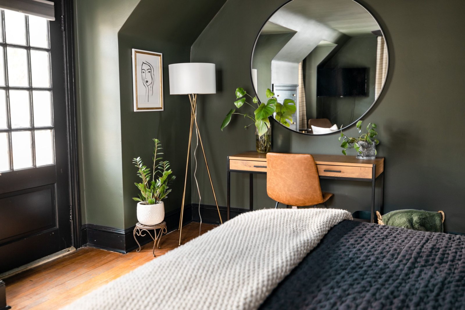
Muted greens are the most forgiving of the group. Sage, eucalyptus, and soft olive all sit comfortably with wood, with white bedding, and with natural textures, and they feel calm in both bright and dim rooms. They work particularly well in bedrooms with plants, because the room’s palette echoes the natural world without imitating it. A muted green on all four walls can feel like being inside a garden room; on one wall, behind the bed, it creates a focal point without overwhelming the room.
Warm tones — soft terracotta, warm clay, muted peach, gentle ochre — are the most enveloping, and they suit bedrooms that feel cold or north-facing, because they add visual warmth where the light does not. They should be used more carefully than greens or blues, because a warm tone that is too strong can feel intense in a small room, especially in lamplight. A warm tone on one wall, or as an accent through bedding and cushions, gives the warmth without the intensity, and it pairs beautifully with wood and with the natural textures of a calm room. How colours tend to feel room by room, and why light and personal taste matter more than any single rule, is explored in Colour Psychology at Home: Choosing Colours Room by Room, which is a useful companion to this guide because it separates general tendencies from rigid claims.
Light, Room Size and Colour Choice
Light changes colour more than any other factor, and a bedroom’s light is specific to that room: its direction, its size of window, its time of day. A north-facing bedroom gets cool, indirect light all day, which makes colours look cooler and greyer than they do on a chart. Warm colours — warm neutrals, muted greens with yellow in them, warm tones — compensate for that cool light and stop the room feeling cold. A south-facing bedroom gets warm, direct light, which makes colours look warmer and brighter; cool colours — cool neutrals, dusty blues, muted greens with grey in them — balance that warmth and stop the room feeling too hot.
Room size changes colour too, though not in the simple way people often assume. A dark colour in a small room does not automatically make it feel smaller; a deep, muted colour on all four walls can make a small bedroom feel cosy and enveloping, like a cocoon, especially with soft lighting. What makes a small room feel cramped is contrast — a dark wall against a white ceiling and white woodwork, which chops the room into pieces — rather than darkness itself. Painting the ceiling and woodwork in a tone close to the wall colour, rather than stark white, unifies a small room and makes it feel larger, even in a deeper colour.
Artificial light is the third factor, and it is the one most often forgotten. A warm-toned bulb makes wall colours look warmer and yellower in the evening, which is when a bedroom is most used. A cool-toned bulb makes them look cooler and greyer. If the bedroom’s evening light is warm, as it usually is with bedside lamps, test wall colours under that light, not just in daylight, because the evening colour is the one you will live with at night. A colour that looks perfect at noon but harsh or muddy under lamplight is not the right colour for a bedroom.
The whole-home view matters as well. A bedroom colour should sit comfortably with the colours of the rest of the home, not because every room must match, but because moving from room to room should not feel jarring. A bedroom in a soft, muted tone that echoes the home’s overall palette — the same undertone family, a similar depth — feels like part of the home rather than a separate experiment, and that continuity is part of what makes a home feel calm. That whole-home palette thinking is covered in How to Choose a Colour Palette for Your Whole Home, which shows how to choose colours that work across rooms rather than in isolation.
Pairing Colour With Bedding and Wood
A wall colour never exists alone in a bedroom. It exists next to bedding, which is the largest area of colour in the room, and next to wood — bed frame, wardrobe, chest of drawers — which has its own colour and warmth. A wall colour that fights either of those will never feel restful, however good it looks on a chart. The pairing should be considered as a trio: wall, bedding, wood, each supporting the others.
Start with the wood, because it is the hardest to change. Warm wood — oak, pine, walnut — has yellow, red, or brown undertones, and it pairs best with wall colours that share that warmth: warm neutrals, muted greens with yellow in them, warm tones. Cool wood — ash, pale birch, painted white or grey furniture — pairs best with cool wall colours: cool neutrals, dusty blues, muted greens with grey in them. A warm wood bed against a cool grey wall can work, but it needs a bridge — bedding in a tone that contains both, or a rug that ties them together — or the room will feel divided.
Bedding is the easiest pairing to adjust, and it should be used as the room’s colour laboratory. Before repainting, try a new duvet cover or throw in the colour you are considering for the walls, and live with it for a week. If the bedding colour feels restful and works with the wood, the wall colour probably will too. If it feels wrong, you have learned something for the price of a duvet cover rather than the price of a repaint. Bedding is also where accent colour belongs: a wall in a soft neutral, bedding in a muted green or blue, and a throw in a warmer tone gives the room depth without a single strong wall.
Finally, remember that a bedroom colour is a background, not a feature. The most restful bedrooms are not those with the most interesting wall colour, but those where the wall, bedding, and wood work together quietly, so that nothing demands attention and everything feels settled. That settled feeling is the same calm that makes a bedroom restful in the first place, as described in Calm Bedroom Ideas for Better Sleep and Slower Mornings, where clear surfaces and soft light are treated as the foundation of rest. Choose a colour that lets the room be quiet, and the room will do the rest.
FAQ: Bedroom Colours
What is the most relaxing bedroom colour?
There is no single answer, because light and taste matter more than any rule. Soft neutrals are the safest choice, muted greens and blues are the most popular relaxing colours, and warm tones suit cold or north-facing rooms. The most relaxing colour for your bedroom is the one that looks calm in your room, under your light, with your bedding and wood.
Should I paint all four walls the same colour?
Usually, yes, especially in a small bedroom, because it unifies the room. One accent wall behind the bed can work well, particularly in a deeper or warmer tone, but it should be a deliberate focal point rather than a leftover, and it should share an undertone with the other walls.
How do I test a bedroom colour properly?
Paint a large test patch, at least a metre square, on the wall you see most from the bed, and look at it in morning light, evening light, and lamplight over several days. A small chart swatch, or a patch viewed only in daylight, will not tell you how the colour behaves at night, which is when a bedroom matters most.
Can a dark colour work in a small bedroom?
Yes, if it is muted rather than bright, and if the ceiling and woodwork are painted in a close tone rather than stark white, so the room reads as one enveloping space rather than chopped-up pieces. A deep muted green or blue in a small bedroom can feel cosy and cocoon-like, especially with soft, warm lighting.
Conclusion
Choosing a bedroom colour that helps you unwind is less about finding a magic shade and more about testing a colour in your room: start with soft neutrals if you are unsure, consider muted greens, blues and warm tones for character, weigh the room’s light and size, and pair the wall with bedding and wood that share its undertone. Test a large patch under daylight and lamplight, live with it for a few days, and choose the colour that lets the room be quiet. A bedroom colour chosen this way will not need repainting, because it was chosen for the room it is actually in.
1 thought on “How to Choose Bedroom Colours That Help You Unwind”