
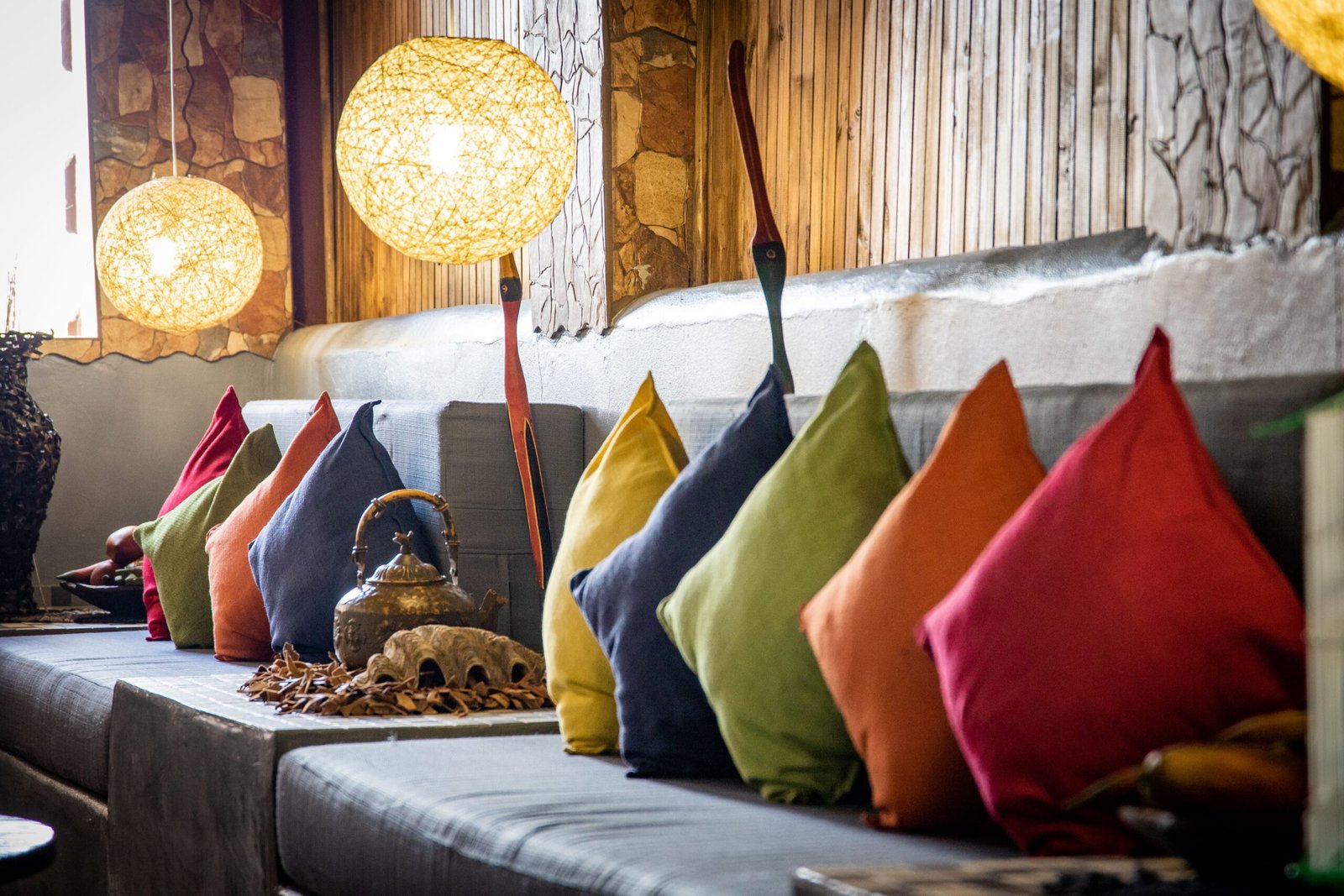
Walk into a paint shop and colour psychology sounds beautifully simple: blue calms, yellow energises, green restores, and red excites. Then you paint a bedroom blue and it feels cold rather than calm, or you choose a cheerful yellow for a kitchen and find it glaring at breakfast. The problem is not that colour has no effect on how a room feels. It is that colour never works alone. Light, room size, furniture, flooring, and your own associations all shape how a shade behaves once it is on the wall.
That is why a room-by-room approach to colour psychology at home works better than a list of universal rules. Instead of asking what a colour means in theory, it is more useful to ask what it does in a particular room, at a particular time of day, for the people who actually use that space. A soft blue may feel restful in a bedroom with warm bedding and a wooden floor, and chilly in a bathroom with white tiles and bright daylight. The same green can feel fresh in a kitchen and gloomy in a dim hallway.
Why the Same Colour Feels Different in Different Rooms
A colour is not a fixed object. It is light reflected off a surface, and everything around that surface changes what you see. A north-facing room, which receives cooler and often dimmer daylight, tends to make colours look greyer and flatter. A south-facing room, flooded with warm sunlight for much of the day, can make the same shade look brighter, warmer, and sometimes more intense. That is one reason a sample that looked perfect in the shop, or in a friend’s house, can surprise you at home.
Personal association is the final, and often strongest, influence. A colour you associate with a childhood home, a holiday, or a room you loved will feel different to you than it does to someone else, whatever any general guidance says. If a supposedly calming colour reminds you of a dull office, it will not calm you. If a bold colour makes you smile every time you see it, that counts for more than a rule that says to use it sparingly. Colour psychology at home is most useful as a starting point for your own judgement, not a replacement for it.
What to check before you commit to a colour
- Check the sample beside your flooring, worktops, tiles, and main furniture, not just against a white wall.
- Live with the sample for a few days. A colour you love at first glance is not always one you love at seven in the morning.
- Consider the room’s purpose first, and let that guide whether you lean towards a calmer or more energising version of a shade.
For a wider framework before you settle individual rooms, Choosing a Whole-Home Colour Palette explains how to build one neutral base and a small set of accents that can run through the house, so rooms feel related even when their colours differ.
Calm Colours for Bedrooms and Bathrooms
Bedrooms and bathrooms are the rooms where most people want to slow down. That does not mean they must be white, beige, or boring. It means the colours there usually work best when they are softer, less saturated, and less contrasting than the colours you might choose for a social space. The aim is a room that does not demand attention, so your mind can settle.
In bedrooms, muted blues, soft greens, gentle greys, and warm off-whites are popular for good reason. They tend to recede rather than advance, which can make a room feel quieter and more spacious. But the best colours for bedroom calm depend heavily on light. In a cool, north-facing bedroom, a very pale blue or grey can feel cold, especially in winter. A warmer alternative — a soft sage green, a warm grey with a hint of brown, or a creamy off-white — may feel calmer simply because it does not fight the light.
Texture matters here too. A bedroom painted in a soft colour but filled with shiny, hard surfaces can still feel restless. Linen bedding, a woollen throw, a wooden bedside table, and a soft rug help the colour feel settled. In a bathroom, similar thinking applies: a soft blue-green or warm neutral on the walls, paired with natural wood and soft towels, feels calmer than a bright white bathroom with harsh lighting, even if the paint colours are similar.
For a fuller treatment, see Choosing Bedroom Colours That Help You Unwind, which walks through warm and cool bedrooms, light levels, and the small details — bedding, curtains, and lighting — that make a calm colour actually feel calm.
Warm, Social Colours for Living Rooms and Dining Rooms
Living rooms and dining rooms are social spaces, and their colours can afford to be warmer and more welcoming. Warm neutrals — cream, warm beige, soft terracotta, muted peach — tend to make a room feel inviting, especially in the evening when artificial light warms them further. These colours suit gathering, conversation, and long meals, because they feel generous rather than stark.
That does not mean a living room must be warm-toned. A cool, pale living room can feel calm and spacious, especially if it receives a lot of daylight. The difference is in emphasis: a social room can handle a little more contrast and a little more richness than a bedroom. A deep green accent wall, a warm ochre cushion, or a terracotta rug can add character without making the room feel busy, provided the rest of the palette stays calm.
Dining rooms, in particular, benefit from colours that flatter both the room and the food. Warm, muted tones — soft reds, warm browns, deep greens, and warm neutrals — tend to work well, because they feel rich without being loud. A very bright, saturated red can feel exciting for a short meal but tiring over a long evening, while a muted, earthy red feels warm for hours. If you eat mostly in the evening, test colours under artificial light, not just daylight, because warm bulbs will shift them noticeably.
Energising Colours for Kitchens and Workspaces
Kitchens and home workspaces need a different kind of energy. These are rooms where you want to feel alert, focused, and able to work, rather than deeply relaxed. That does not mean they must be bright yellow or bold red. It means the colours there can be a little clearer, a little brighter, and a little more contrasting than in a bedroom, without feeling harsh.
In a kitchen, white and pale neutrals remain popular because they feel clean and bright, but they work best when paired with a warmer or more natural element — wood, stone, or a muted accent — so the room does not feel clinical. A soft sage, a pale blue-grey, or a warm cream can all feel fresh in a kitchen, especially with good daylight. Stronger colours work well as accents: a deep green on lower cabinets, a terracotta tile, or a navy island can give a kitchen character while the main surfaces stay light and practical. Kitchen Colour Ideas From Classic White to Bold and Moody explores this range in more detail, from timeless whites to deeper, moodier schemes.
Home workspaces benefit from a similar balance. A very pale, calm wall colour helps concentration, while a single accent — a deep green, a muted blue, or a warm ochre — can add just enough stimulation to keep the room from feeling dull. Avoid very bright, high-contrast combinations for long working hours, as they can be tiring to look at all day. A mid-tone, muted colour, with good lighting and a clear desk, usually supports focus better than a dramatic one.
Colour in Hallways, Small Rooms and Shared Spaces
Hallways, stairwells, and small rooms are often overlooked, but their colours shape how the whole home feels. A hallway painted in a very dark colour can feel like a tunnel, while a very pale hallway can feel like a blank corridor. A mid-tone warm neutral, or a soft colour that echoes a room it leads to, usually works best: it gives the hallway its own identity without making it feel separate from the rest of the home.
Small rooms, in particular, do not have to be white to feel larger. A soft, mid-tone colour with good lighting can feel more intentional and more spacious than a stark white room with no warmth. The key is contrast: keep the ceiling light, use a single main colour rather than several competing ones, and let furniture and flooring provide the contrast rather than the walls. A small room painted in a soft green or warm grey, with a light ceiling and a clear floor, often feels larger than the same room painted white but cluttered.
Shared spaces — a family bathroom, a play area, a utility room — benefit from colours that are practical as well as pleasant. Mid-tones hide marks better than very pale colours, and a colour that suits both adults and children, such as a soft green or warm neutral, will age better than a very themed or very bright choice. In these rooms, durability and ease of cleaning matter as much as psychology, and a colour that looks good after a year of use is a better choice than one that looks perfect for a week.
Testing Colours Before You Commit
Colour psychology is only useful if the colour you choose actually behaves as you expect in your room, so testing matters more than theory. Paint large samples, not tiny swatches: a colour that looks soft on a small card can look much stronger on a whole wall. Paint the sample on the wall itself, or on a large board you can move around the room, and look at it in morning, afternoon, and evening light, and under the artificial lights you actually use.
Also test the colour against the room’s fixed elements. Flooring, tiles, worktops, and large furniture will not change, and they will influence how the wall colour reads. A warm wood floor will warm a cool wall colour; a grey tile will cool a warm one. If the sample clashes with a fixed element, it is better to find out before painting the whole room.
Finally, trust your own response after living with a sample for a few days. If a colour that is supposed to be calming makes you feel flat, or a colour that is supposed to be energising makes you feel restless, that response is data, not a failure. Colour psychology offers a helpful starting point, but the best colour for a room is the one that supports how you actually want to feel and live in that space.
For a broader view of how colour families are named and matched, the colour authority Pantone is a useful reference, especially if you want to compare shades across brands and see how muted, earthy, or vivid versions of the same hue behave.
FAQ: Colour Psychology at Home
Does blue really make a bedroom calmer?
It can, but it depends on the shade and the light. A soft, warm-leaning blue in a bedroom with warm bedding and natural wood often feels calm. A very pale, cool blue in a north-facing bedroom can feel cold instead. Test the exact shade in your room, with your bedding and lighting, rather than relying on the colour name alone.
Should a small room always be painted white?
No. A soft mid-tone colour with good lighting and a light ceiling can feel more spacious and more intentional than stark white, especially if the room is cluttered. White works well in small rooms, but it is not the only option, and a warm, muted colour often feels more welcoming.
How many colours should I use in one room?
A useful guide is one main colour, one or two supporting colours, and one accent, all repeated in small doses. That keeps the room coherent without feeling flat. More colours can work, but they need careful repetition and a neutral base to avoid feeling busy.
Can I use a bold colour without repainting the whole room?
Yes. A bold colour on one wall, or in accessories such as cushions, throws, curtains, or art, can give a room energy without overwhelming it. Start with accessories, live with the colour for a while, and only commit to a full wall if it still feels right.
Do I need to match colours across the whole house?
Not exactly, but rooms should feel related. A shared neutral base, with a small set of accents that repeat in different rooms, creates flow without making every room identical. That approach is more flexible than trying to match every wall colour exactly.
Conclusion
Colour psychology at home works best when it is treated as a guide, not a set of rules. Blue, green, yellow, and red all have tendencies — to calm, to restore, to energise, to excite — but those tendencies are shaped by light, room purpose, fixed elements, and your own associations. Choose colours room by room, test them in real light, and trust how they make you feel in the space you actually live in. The best colour scheme is not the one that follows a chart most closely. It is the one that helps each room do its job, and helps you feel at home in it.
3 thoughts on “Colour Psychology at Home: Choosing Colours Room by Room”