
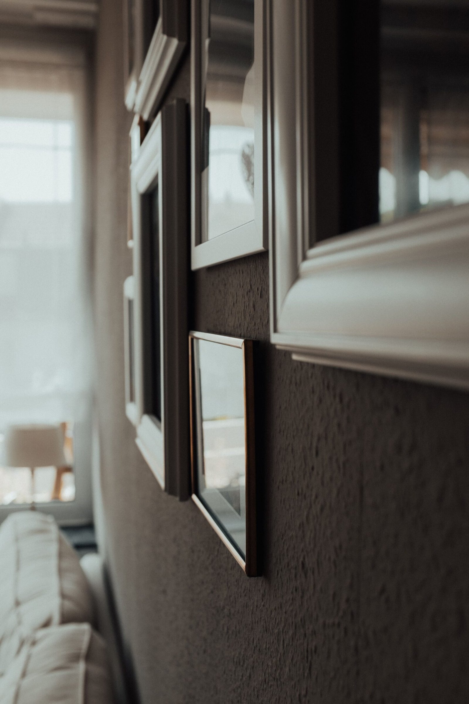
Blank walls can make even a well-furnished room feel unfinished, but filling them does not have to mean spending a fortune or buying a matching set of prints that looks like it came straight out of a showroom. The best budget wall decor ideas work because they are thoughtful, not expensive: a clear layout, consistent framing, and art that actually relates to the room around it. When those three things are in place, a wall can look collected and intentional, even if most of what is on it cost very little.
The trick is to stop thinking of wall decor as a shopping problem and start thinking of it as a design problem. A single well-placed piece, a calm arrangement of frames, or a bold do-it-yourself project will almost always look better than a random collection of small items bought in a hurry.
Why Small, Scattered Art Looks Lost
Most disappointing walls share the same problem: several small pieces, hung too high, too far apart, and with nothing connecting them. On their own, each item might be perfectly nice. Together, they read as leftovers, because the eye has no clear place to land and no sense of scale. A wall is a large surface, and small art needs help to hold its own against it.
Scale is the first thing to fix. As a rough guide, the art above a sofa, console, or bed should span roughly two-thirds of the width of the furniture below it. That does not mean one huge frame is required — a group of frames, a pair of larger prints, or a shelf arrangement can fill the same width.
Spacing matters just as much. Frames hung a hand’s width or more apart tend to drift apart visually, while frames grouped with just a few centimetres between them read as a single display. The same applies to height: art hung well above eye level, or with a large gap between it and the furniture below, can look stranded.
Gallery Walls That Actually Work
A gallery wall on a budget is one of the most forgiving ways to fill a large wall, because the arrangement itself does the heavy lifting. You can mix photographs, prints, postcards, children’s artwork, and even small textile pieces, as long as the layout is planned before anything goes on the wall. The most common mistake is to start hammering nails and hope the arrangement sorts itself out. It rarely does.
Start by choosing your anchor: one larger piece that will sit slightly off-centre or in the middle of the arrangement. Everything else should relate to it in size, stepping down gradually rather than jumping from very large to very small. Lay the whole arrangement out on the floor first, or trace each frame onto paper and tape the paper shapes to the wall. This step takes a little patience, but it is what prevents the lopsided, top-heavy gallery walls that so often look accidental.
Planning a layout that looks intentional
- Pick a shape for the overall display — a rectangle, a loose grid, or a salon-style cluster — and keep the outer edges fairly tidy, even if the inside is relaxed.
- Keep gaps consistent, usually between five and eight centimetres, so the group reads as one unit.
- Mix orientations, but repeat at least one element: the same frame colour, the same mount colour, or a recurring colour in the artwork.
- Leave breathing room around the display. A gallery wall that runs right up to a door frame or ceiling can feel cramped, however good the art inside it is.
Affordable wall art ideas work best when you mix sources rather than buying everything from one place. Family photographs printed in black and white, pages from old calendars, botanical prints, maps, and your own photography can sit happily side by side if the framing is consistent. Simple frames in black, natural wood, or white are usually the safest choice, and buying them in a single style — even in different sizes — will unify the wall far more effectively than a set of ornate, mismatched frames.
In a family home, a gallery wall is also practical: photographs can be swapped as children grow, and a new print can be added without redoing the whole wall. For more on keeping a busy room calm, see Family-Friendly Living Room Ideas That Still Look Smart.
Large-Scale Ideas on a Small Budget
When a wall is very large, small frames — however well arranged — can still feel lost. This is where large-scale ideas earn their keep. The aim is to cover more wall with fewer pieces, using materials that are inexpensive by the square metre rather than by the print.
Paint is the most obvious starting point, and also the most underestimated. A painted arch, a half-height colour block behind a bed or sofa, or a simple geometric shape can act as the artwork itself, with one or two frames layered over it. Because the colour does the work, the frames can be simple and the art inside them can be quiet. Before choosing a shade, it helps to think about the room as a whole, which is why How to Choose a Colour Palette for Your Whole Home is worth reading alongside this guide — a wall feature that clashes with the rest of the house will stand out for the wrong reasons.
Fabric is another underused option. A length of interesting cloth, stretched over a simple wooden frame or hung from a dowel, can fill a large area for a fraction of the cost of a framed print of the same size. Curtain fabric, a vintage tablecloth, or a woven throw can all work, and fabric adds a softness that suits bedrooms and living rooms particularly well. The same principle applies to wallpaper: a single framed panel of a patterned paper, or a strip applied to one wall, can give a room a focal point without papering the whole space.
Big-impact projects worth trying
- A painted shape or colour block, finished with clean masking-tape edges, behind a bed or dining table.
- Oversized photography printed at a copy shop and mounted on foam board, framed simply or hung with clips.
- A large mirror, which reflects light and makes a room feel bigger — especially useful in hallways and small living rooms.
- A plate wall, basket wall, or collection of woven pieces, which adds texture where flat prints can feel cold.
- Open shelving with a few objects and small frames layered in front, which decorates the wall and adds storage at the same time.
Objects on the wall deserve the same care: a basket wall looks best when the baskets share a tone or material, and shelves work best when styled rather than stuffed — How to Style Open Shelving Without It Looking Messy explains how to strike that balance.
Frames, Mats and Hanging Heights
Frames and mats are where budget wall decor either comes together or falls apart. A wide mat around a small print can make it feel far more substantial, which is a useful trick when you have a small piece you love but a large wall to fill. White or off-white mats suit most rooms and most artwork, and they give the eye a rest between the art and the frame. If you are framing photographs, a consistent mat colour across the whole display will do more for cohesion than any single expensive frame.
When it comes to frames, simpler is usually better. Thin black, white, or natural wood frames recede and let the artwork speak, while heavy, ornate frames can fight with the art and with each other. Second-hand frames can be sanded and repainted in a single colour, which is one of the cheapest ways to make a mixed collection look like a set.
Hanging height is the detail most people get wrong. As a general rule, the centre of a piece — or of a gallery arrangement as a whole — should sit roughly at eye level, around 145 to 155 centimetres from the floor. Above furniture, the bottom of the frame should sit about 15 to 20 centimetres above the furniture itself, close enough that the art and the furniture read as a pair.
Finally, step back and check the display from the doorway, in daylight and in the evening; shifting a frame a few centimetres often finishes a wall. Museums such as the Victoria and Albert Museum show how consistent spacing and framing let very different objects sit together calmly, and the same principles work at home.
FAQ: Budget Wall Decor
How do I decorate a large blank wall without spending much?
Start with scale, not shopping. A painted colour block, a large mirror, a fabric panel, or a well-planned gallery wall will fill a large wall far more effectively than several small, unrelated prints. Choose one approach, plan the layout on paper or on the floor first, and repeat one element — frame colour, mat colour, or palette — throughout the display.
What is the cheapest way to make wall art look expensive?
Consistent framing and generous mats are the biggest upgrade for the least money. Simple frames in one colour, clean glass, and a wide white or off-white mat will make even an inexpensive print look considered. Hanging at the right height and keeping gaps even matters just as much as what is inside the frame.
Can I mix photographs and art prints on the same wall?
Yes, as long as something ties them together. Black-and-white photographs sit well with muted prints, and colour photographs work with art that shares one or two of their colours. A common frame style and a consistent layout will bridge the gap between very different subjects, so a family photo can hang happily beside an abstract print.
How high should I hang pictures above a sofa?
Aim for the bottom of the frame to sit about 15 to 20 centimetres above the back of the sofa, with the centre of the display roughly at eye level when standing. If the gap is much larger, the art and the sofa will look like two separate elements rather than one arrangement, and the wall between them will feel empty.
Is a gallery wall still a good idea in a small room?
Yes, with restraint. In a small room, a compact gallery wall with consistent frames and a limited palette can add interest without overwhelming the space. Keep the overall shape tidy, avoid letting the display creep too close to the ceiling or neighbouring door frames, and consider a grid layout, which tends to feel calmer than a sprawling salon-style arrangement in a tight space.
Conclusion
Budget wall decor looks cheap when it looks accidental — small pieces scattered too high, frames that fight each other, and no clear relationship between the art and the room. It looks expensive when the opposite is true: a layout planned before hanging, a consistent frame or palette running through the display, and art sized and hung in proportion to the wall and the furniture below it. None of that requires a large budget. It requires a little patience, a tape measure, and the willingness to lay things out on the floor before reaching for a hammer.
Start with one wall, and one idea from this guide — a gallery wall, a painted shape, or a set of frames repainted in a single colour — and see how much difference it makes. Once that wall feels finished, the rest of the house tends to follow, one considered arrangement at a time.
1 thought on “Budget-Friendly Wall Decor Ideas That Don’t Look Cheap”