
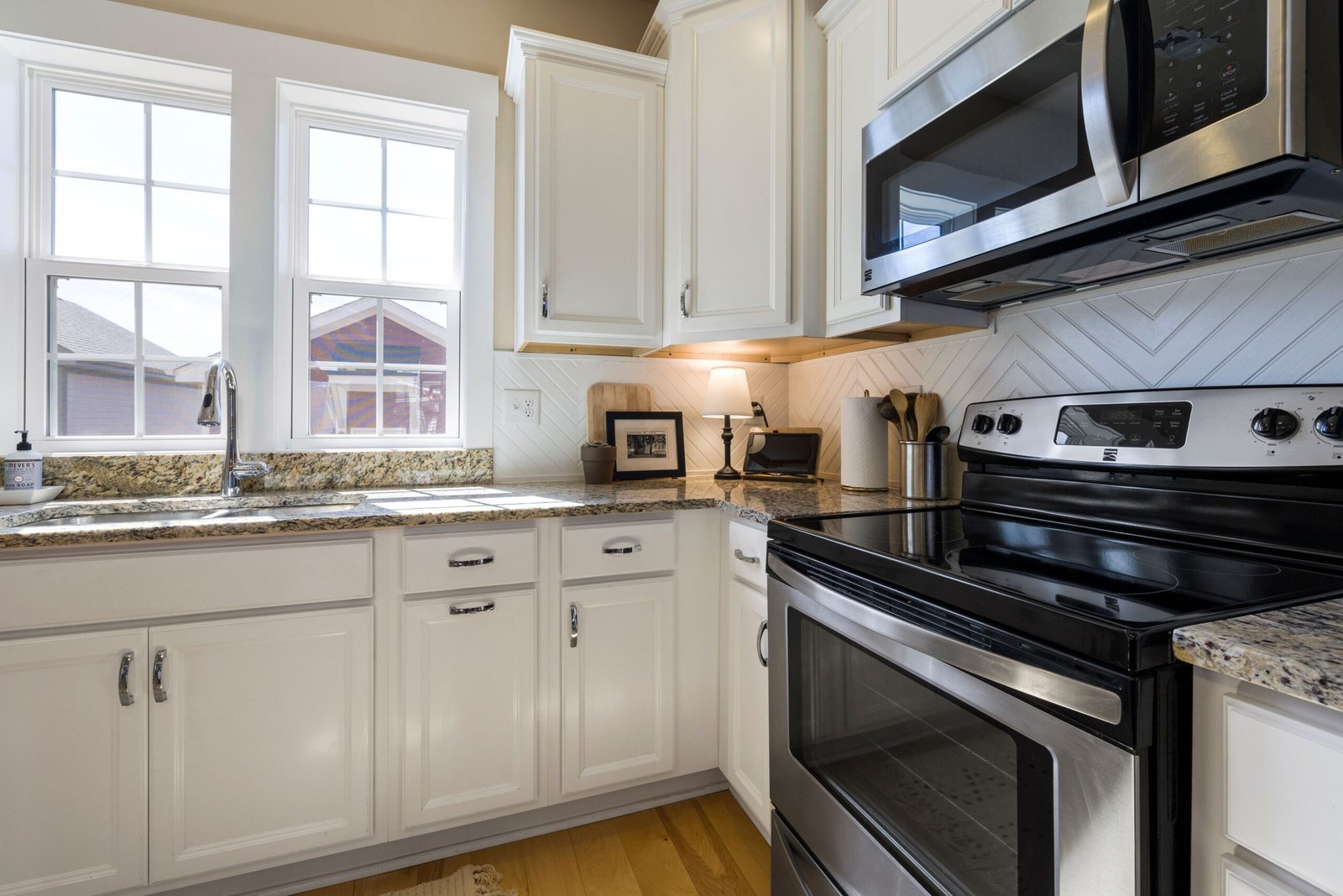
Kitchen colour is a long-term decision disguised as a decorating one. Cabinets, worktops and tiles stay for years, and repainting a kitchen is a far bigger job than repainting a bedroom. That is why kitchen colour choices feel so high-stakes, and why so many kitchens end up either safely white by default or bold by impulse, with little in between. There is a middle path, and it runs from classic white through warm neutrals to bold and moody palettes, with the same questions at each step: how does this colour behave in this kitchen’s light, with this worktop, and over this many years?
This guide walks that path. It covers why classic white endures, what warm neutrals and wood bring to a kitchen, when bold and moody colours genuinely work, and how to pair cabinets, walls and worktops so the whole room holds together. The aim is colour confidence: a kitchen colour you will still like in five years, not just on the day it is finished.
Classic White and Why It Endures
Classic white endures for practical reasons, not just aesthetic ones. White reflects light, which matters in kitchens that are small, north-facing, or short on windows. White shows dirt, which sounds like a drawback but is actually useful in a room where hygiene matters — you can see what needs cleaning. And white is forgiving: it works with almost any worktop, any floor, and any appliance colour, which means a white kitchen can be updated with handles, a splashback, or a new worktop without repainting the cabinets.
White is not one colour, though, and the difference matters. A warm white, with a yellow or pink undertone, feels soft and inviting, especially in a kitchen with cool light. A cool white, with a grey or blue undertone, feels crisp and modern, but can feel clinical in a dim kitchen. A bright, stark white can glare under strong artificial light. The right white for a kitchen is the one that looks calm under that kitchen’s actual light — daylight, evening light, and the light from under-cabinet strips — not the one that looked best on a chart in a shop.
White also needs texture and contrast to avoid feeling flat. A white kitchen with white walls, a white worktop, and white tiles can feel like a laboratory. The same white cabinets with a wooden worktop, a coloured splashback, or dark handles gain warmth and character without losing any of white’s practical advantages. Contrast does not need to be dramatic: a wooden chopping board, a coloured kettle, a plant on the windowsill all break up white enough to make it feel like a room rather than a showroom.
Longevity is white’s strongest argument. Trends in kitchen colour come and go, but a white kitchen rarely looks dated in the way a strongly coloured kitchen can, because white does not belong to a particular era. That does not mean a white kitchen is boring — it means its character comes from materials, handles, and styling, which are far easier and cheaper to change than cabinet colour. For a kitchen you plan to live with for a decade, that flexibility is worth a great deal.
Warm Neutrals and Wood
Warm neutrals — soft greys with a warm undertone, gentle beiges, pale taupes, warm greiges — are the natural next step from white, and they suit kitchens that feel cold or stark in pure white. A warm neutral on cabinets adds depth without darkness, and it pairs beautifully with wood, which is the other great warm material in a kitchen. A wooden worktop, wooden open shelves, or a wooden floor all sit comfortably against warm neutral cabinets, and together they make a kitchen feel welcoming in a way white alone sometimes does not.
Wood deserves attention in its own right. A wooden worktop warms a kitchen instantly, but it needs care: regular oiling, prompt wiping of spills, and acceptance that it will mark and age over time. Many cooks love that ageing — a worktop that records years of use feels like part of the home — while others prefer a worktop that stays pristine, in which case a stone or laminate worktop in a warm tone gives much of the same warmth without the maintenance. The choice is about how you actually live in the kitchen, not about which material looks best in a photograph.
Warm neutrals also handle the mess of real cooking better than white. A splash of tomato sauce, a coffee ring, a fingerprint on a cabinet door — all show less on a warm neutral than on white, which is a small but genuine advantage in a room that is used hard every day. That does not mean warm neutrals hide dirt; it means they forgive the minor marks of daily life between cleans, which makes a kitchen feel less demanding to keep presentable.
Pairing warm neutrals with the rest of the home matters too. A kitchen in a warm neutral that echoes the home’s overall palette — the same undertone family as the living room or hallway — feels like part of the home rather than a separate room with its own rules. That continuity is part of what makes a home feel calm, and it is a useful test for any kitchen colour: does it sit comfortably with the colours you already live with, or does it fight them? How colours tend to feel room by room, and why light and taste matter more than any single rule, is explored in Colour Psychology at Home: Choosing Colours Room by Room, and whole-home palette thinking is covered in How to Choose a Colour Palette for Your Whole Home.
Bold and Moody Kitchens
Bold and moody kitchens — deep greens, navy blues, charcoal, dark teal, even black — have become popular, and they can be stunning. They work best in kitchens with good light, generous proportions, or a strong contrast element that keeps them from feeling like a cave. A deep green kitchen with a light worktop, brass handles, and plenty of daylight feels rich and enveloping. The same deep green in a small, dim kitchen with a dark worktop can feel oppressive, however fashionable the colour is.
The key to a bold kitchen is balance. Bold cabinets need light somewhere: a light worktop, light walls, a light floor, or strong artificial light that can be adjusted. They also need a restful element: wood, which warms a dark colour; brass or copper handles, which catch the light; or open shelving with light-coloured crockery that breaks up a run of dark cabinets. Without that balance, a bold kitchen can feel heavy, and heaviness is tiring to live with every day.
Moody colours also change more dramatically with light than pale colours do. A navy kitchen can look almost black in the evening and rich blue in daylight; a deep green can look grey in cool light and warm in evening lamplight. That variability is part of their appeal, but it means testing is essential: paint a large sample, look at it in morning light, evening light, and under the kitchen’s artificial lights, and live with it for several days before committing to a whole kitchen.
Longevity is the honest question for bold kitchens. A bold colour that you love today may feel dated sooner than a neutral, because bold colours are more tied to trends. That does not mean avoiding them — a kitchen should reflect the people who cook in it, not a resale calculation — but it does mean choosing a bold colour you genuinely love, in a shade with depth rather than a bright, fashionable tone, and pairing it with materials that will age well alongside it. A deep, muted green with wood and brass will age more gracefully than a bright, saturated colour with plastic handles, because the former is a palette and the latter is a trend.
Pairing Cabinets, Walls and Worktops
A kitchen colour is never a single decision. It is a trio: cabinets, walls, and worktops, each affecting how the others look. A cabinet colour that looks perfect on its own can fail against the wrong worktop, and a worktop that looks beautiful in a showroom can fight the cabinets it is paired with. The trio should be considered together, with samples held side by side under the kitchen’s actual light, before any of them is fixed.
Start with the element that is hardest to change, which is usually the worktop or the floor. If the worktop is staying, its colour and undertone set the range for cabinet colours that will work with it. A worktop with a warm undertone pairs best with warm cabinet colours; a cool-toned worktop pairs best with cool ones. If the worktop is being replaced, it can be chosen to support the cabinet colour you want, but the pairing still needs to be tested together, because two materials that look good separately can clash when they meet along a long edge.
Walls are the easiest element to change, and they should be used as the flexible part of the trio. A wall colour that is a softer, lighter version of the cabinet colour unifies the room; a wall in a contrasting tone — a warm white against deep green cabinets, for example — provides the light that a bold kitchen needs. Walls are also where a kitchen can gain personality cheaply: a painted wall, a tiled splashback, or a single accent wall can carry colour that would be too much on every cabinet, and can be changed far more easily if tastes change.
Finally, consider the budget reality. Repainting cabinets, changing handles, and updating a splashback can transform a kitchen’s colour without replacing the cabinets at all, and that lower-cost route is often the wisest first step, as covered in Budget Kitchen Makeover Ideas That Don’t Require New Cabinets. A kitchen colour chosen through that route — tested on a few doors, lived with for a while, then extended — is a colour chosen with evidence rather than hope, and it is far more likely to still please in five years.
FAQ: Kitchen Colours
What is the safest kitchen cabinet colour?
A warm or neutral white, because it reflects light, works with almost any worktop, and rarely looks dated. Warm neutrals are the next safest step if pure white feels too stark, especially in a kitchen with cool or limited light.
Can a dark kitchen colour work in a small kitchen?
Yes, if it is balanced with light: a light worktop, light walls or floor, and good artificial light. A dark colour on all surfaces — cabinets, worktop, walls — in a small kitchen will usually feel cramped, but a dark colour with light contrasts can feel cosy and enveloping rather than small.
How do I test a kitchen colour properly?
Hold large samples of cabinet, worktop, and wall colours together under the kitchen’s daylight, evening light, and artificial light, over several days. Small swatches viewed only in a shop will not tell you how the trio behaves in your kitchen, which is the only place that matters.
Should kitchen cabinets match the rest of the home’s colours?
They should sit comfortably with them, sharing an undertone family, rather than matching exactly. A kitchen that echoes the home’s palette feels like part of the home; a kitchen in a completely unrelated palette can feel jarring when moving between rooms.
Conclusion
Kitchen colour, from classic white to bold and moody, is a decision about light, longevity, and pairing as much as about taste. White endures because it is practical and flexible; warm neutrals add depth and pair beautifully with wood; bold colours can be stunning when balanced with light and restful materials. Whatever point on that spectrum you choose, test the trio — cabinets, walls, worktops — together under your kitchen’s real light, and choose a colour you will still like in five years. A kitchen coloured that way will not need repainting, because it was chosen for the room it is actually in.