
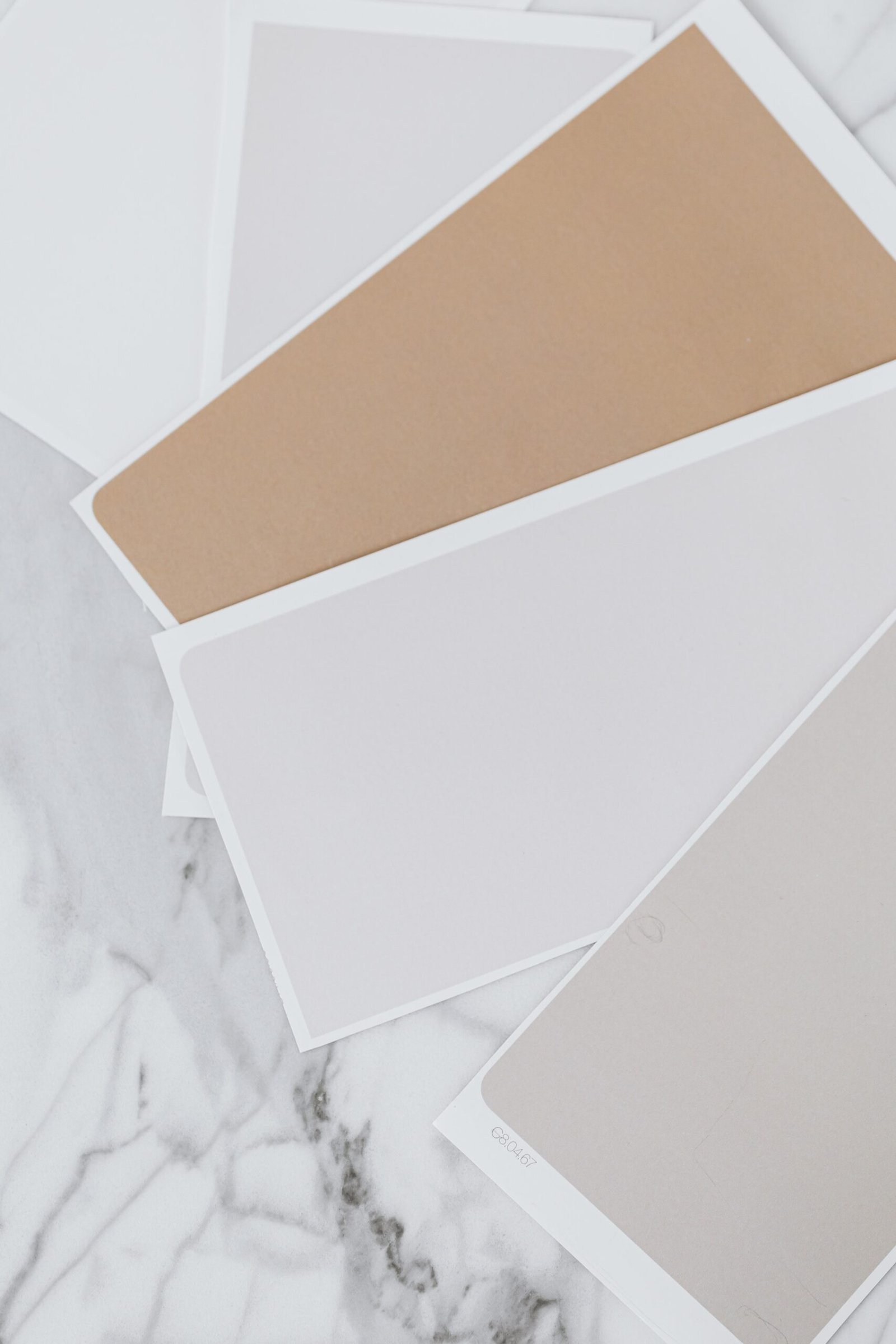
Choosing colours for a whole home can feel surprisingly difficult, even for people who know exactly what they like in a single room. A shade that looks perfect in a bedroom can feel cold in a north-facing kitchen, and a bold colour that works beautifully as an accent can quickly become overwhelming when it is repeated on every wall. The answer is not to play it safe with one shade everywhere, nor to treat every room as a separate project. It is to build a small, flexible palette — a neutral you can live with, a couple of accents you love, and a clear way for rooms to differ without clashing.
When you choose a colour palette for your home in this way, decisions get easier at every step, from paint and flooring to sofas, curtains, and artwork. Instead of starting from scratch in each room, you are working within a framework you have already tested.
Start With One Neutral You Can Live With
Every whole-home palette needs a neutral backbone: a colour that can appear on walls, ceilings, and large pieces of furniture without tiring you out. The best neutral for your home is not necessarily the trendiest white or the one you saw in a photograph. It is the one that works with your light, your flooring, and the way you actually live.
Start by looking at what is already fixed. Flooring, kitchen worktops, bathroom tiles, and fireplaces are expensive to change, and each carries its own undertone — warm, cool, or somewhere in between. Hold paint samples against these fixed elements in daylight, and you will quickly see which neutrals belong and which ones fight.
It also helps to think about how a neutral behaves across a whole house. A very bright, stark white can feel clean in a sunny room but harsh in a dim hallway, while a soft, warm off-white tends to travel better from room to room. Use the same neutral, or very close variations of it, for walls and trim throughout the main living spaces.
A neutral colour palette home base like this does not mean a colourless home. Think of the neutral as the quiet background that lets furniture, art, plants, and accents stand out. If the background is calm, you can be bolder elsewhere without the house feeling chaotic. For a room-by-room look, Colour Psychology at Home: Choosing Colours Room by Room explores how different shades affect each space.
Add Two Accents, Not Ten
Once the neutral is settled, the temptation is to add colour everywhere — a feature wall here, a bright sofa there, cushions in every shade you liked in the shop. The result is usually a home that feels busy rather than colourful, because no single accent gets a chance to register. A tighter approach works better: choose two accent colours, and possibly a third used very sparingly, and repeat them deliberately throughout the house.
Your accents do not need to be bold to be effective. A deep green paired with a warm ochre, a dusty blue with a soft terracotta, or a muted plum with a sage green can all give a home character without shouting. What matters is that the two colours work together and that both work with your neutral. Test them side by side on fabric, paint, and artwork — not just as paint chips — and check that you still like the combination after looking at it for a few days, not just a few minutes.
How to use your accents
- Use the first accent as your main supporting colour: upholstery, curtains, a rug, or a painted piece of furniture.
- Use the second accent in smaller doses: cushions, throws, vases, artwork, and books, so it punctuates rather than dominates.
- Repeat both accents in more than one room, even in a small way, so the house feels linked rather than divided.
- Keep very bright or very dark versions for small items. A large area of a strong colour is much harder to live with than a cushion in the same shade.
Repetition is the key to cohesive home colours. If a deep green appears only in one room, it can feel like an accident; if the same green turns up as a cushion in the living room, a vase in the hallway, and a painted chair in the bedroom, it reads as a deliberate thread running through the house.
Restraint also pays off financially. When your palette is limited, pieces bought for one room can move to another without clashing, and a new cushion or throw is far more likely to work with what you already own.
How Rooms Can Differ and Still Flow
A cohesive palette does not mean every room has to look the same. In fact, rooms that are identical can feel flat, and a home needs variation to feel interesting. The trick is to vary the proportions, not the palette itself. Each room can lean more heavily on a different part of the same scheme, while still sharing the neutral base and at least one accent with its neighbours.
The living room, as the most public space, is a good place to let the palette show at its fullest. This is where the neutral, both accents, and any pattern can all appear together, and where larger pieces — sofa, rug, curtains — carry the scheme. If you are starting here, Living Room Colour Schemes That Work With Any Sofa offers practical ways to build a scheme around the sofa you already have, rather than replacing it.
Bedrooms can then take a quieter version of the same palette: the same neutral on the walls, one accent in bedding and curtains, and the second accent reduced to a single cushion or piece of art. Bathrooms and hallways can lean on the neutral with just a touch of accent in towels, a mirror frame, or a painted door.
Kitchens need extra care, as cabinets, worktops, and appliances bring their own colours — Kitchen Colour Ideas From Classic White to Bold and Moody shows how a kitchen can still sit within a whole-home scheme, whether classic white or much darker.
Transitions matter too. Hallways and landings are where rooms meet, so keeping the neutral consistent there helps the eye travel smoothly from one space to the next. In an open-plan living and kitchen area, repeating the same flooring, wall colour, and at least one accent across the whole space will stop the area feeling split in two.
Test Your Palette in Real Light
Colour on a paint chip is not colour on a wall. The same shade can look completely different in a north-facing bedroom in winter and a south-facing kitchen in summer, and artificial light changes it again in the evening. Before committing to a whole-home palette, test it properly.
Paint large swatches — at least A3 size — on each wall you plan to change, and live with them for a few days. Check them in morning light, in evening light, and with the lamps you actually use. Colours often look darker on a large wall than on a small chip, so be prepared for your chosen shade to feel stronger than expected.
It also helps to test your palette together, not one colour at a time. Put a cushion, a throw, and a paint sample side by side, and see how they work as a group. If one colour dominates or clashes, adjust it now, while changes are still cheap. For inspiration on how colour works in real interiors, galleries such as the National Gallery show how limited palettes and repeated accents create harmony in paintings, just as they do in rooms.
FAQ: Choosing a Whole-Home Colour Palette
How many colours should a whole-home palette have?
Three to four colours work best for most homes: one neutral backbone, two main accents, and optionally a third accent used very sparingly. More than that tends to make a home feel busy, while fewer can feel flat. The key is repetition across rooms, not the number of colours on a chart.
Should I use the same wall colour in every room?
Not necessarily, but using the same neutral — or very close variations of it — in hallways and main living spaces helps a home flow. Bedrooms and bathrooms can take slightly different versions of the same neutral, as long as the undertone stays consistent. The important thing is that the neutral feels like one family, not several unrelated whites.
What if my furniture does not match my palette?
Start with what you already own. Look for the undertone in your largest pieces — a warm wood floor, a grey sofa, a cream rug — and choose a neutral and accents that work with those fixed elements. A palette built around existing furniture is far easier to live with than one that requires replacing everything to match.
How do I choose accents that will not date quickly?
Choose muted, nature-inspired accents rather than very bright or very trendy shades. Deep greens, dusty blues, warm ochres, and soft terracottas tend to age better than neon or pastel extremes. If you love a bold colour, use it in small, easily changed items such as cushions and vases rather than on walls or large furniture.
Can a whole-home palette work in an open-plan space?
Yes, and it is especially useful there. In open-plan living, a consistent neutral and repeated accents stop the space feeling divided into separate zones. Use the same flooring and wall colour across the whole area, and repeat at least one accent in both the living and kitchen zones to tie them together.
Conclusion
Choosing a colour palette for your whole home is not about finding the perfect shade. It is about building a small, flexible framework: one neutral you can live with, two accents you love, and a way for rooms to differ in proportion without clashing. Test it in real light, repeat it deliberately, and let transitions do the work of tying rooms together.
Start with the neutral. Hold samples against your fixed elements, paint large swatches, and live with them for a few days before committing. Then add your accents slowly, one room at a time, and check that the house still feels like one home rather than a collection of separate rooms. Done this way, colour becomes a tool that makes every future decision — paint, furniture, curtains, artwork — easier, not harder.
5 thoughts on “How to Choose a Colour Palette for Your Whole Home”